Challenge
Oliga Rose needed a visual identity that could move beyond a logo and feel consistent across packaging, print, and digital touchpoints without losing its premium beauty character.
A complete identity and packaging system for a beauty brand, built to feel elegant, cohesive, and memorable across every touchpoint.
Olga Rose was developed as a complete branding journey, starting from the core logo design and extending through to the full packaging system. Every element was carefully crafted to reflect a cohesive visual identity that communicates elegance, consistency, and brand character across all touchpoints. The result is a refined and unified brand experience that brings the Olga Rose vision to life in a clear and memorable way.
Oliga Rose needed a visual identity that could move beyond a logo and feel consistent across packaging, print, and digital touchpoints without losing its premium beauty character.
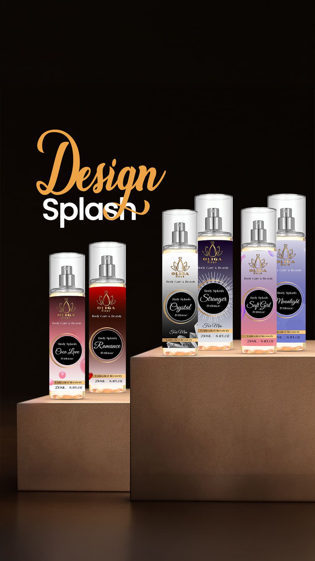
LA STRADA built the brand as a cohesive identity journey, from the core mark to the full packaging direction, balancing elegance, clarity, and shelf-ready product presence.
Oliga Rose
LA STRADA built Oliga Rose as a complete identity system rather than a standalone logo. The identity extended into packaging, print, and product presentation while maintaining a refined and cohesive beauty feel. The result is a clearer, more memorable brand that can show up consistently across different touchpoints.
Oliga Rose needed a visual identity that could move beyond a logo and feel consistent across packaging, print, and digital touchpoints without losing its premium beauty character.
LA STRADA built the brand as a cohesive identity journey, from the core mark to the full packaging direction, balancing elegance, clarity, and shelf-ready product presence.
The result gave Oliga Rose a clearer presence through Graphic Design, strengthening brand expression and making audience communication more structured and effective.

Let LA STRADA shape the identity, packaging, and launch story into one memorable system.